№ 01 Identity & narrative system

A sheet of paper
cannot fly.
A folded one can.

The brand world of FL Public Relations & Communications is built on one gesture: the right fold gives an ordinary surface direction and movement. We do not make our clients louder. We give their words a structure that can carry itself.

FL PR and Communications
Folding success in every message
London · Türkiye — 2026 edition
Folded paper, studio
Fold № 05 — flight
01 The idea

Everything we do begins with a fold.

On its own, a sheet of paper has no direction. It accepts whatever is written on it and goes nowhere. A fold changes that in one gesture: it gives the sheet an edge, a spine, and a direction of travel. Paper remembers every crease it is given.

That is the whole of our practice. Founders and executives arrive with the sheet — a company, a decision, a body of work, a reputation that has never been put into words. Our part is not to add volume. It is to find where the story bends, and to fold it so precisely that it holds its shape in rooms we will never be in.

Nothing is added, nothing is removed. The same sheet, given form. This is why our imagery is paper and our colour is the light we photograph it under, and why our mark is not a symbol of communication but a record of a fold.

Structure, not volume.
Her işi stüdyodan çıkmadan önce bu ölçütle sınarız.
02 The method

Five folds, one flight.

A paper plane is not made in one move. It is made in five, in order, and each one is irreversible. Our engagements are built the same way — five stages, each with its own deliverable, each depending on the crease before it.

  1. First creases
    01Crease
  2. Form emerges
    02Form
  3. Asymmetry and tension
    03Tension
  4. The edge in profile
    04Edge
  5. Flight
    05Flight
Fold one — the first creases
01 Crease · Positioning

Where the story bends.

Before anything is written, we decide where the sheet folds. We read the market, the coverage, the competitors and the founder's own words, then commit to a single position — the one claim everything else will be measured against.

Deliverable — positioning statement, message architecture, proof inventory
Fold two — form emerges
02 Form · Narrative

The shape the story takes.

The position becomes language. One narrative, written once, then set in the forms the work actually needs: the founder's story, the company line, the paragraph a journalist can lift without calling us to check it.

Deliverable — master narrative, biographies, boilerplate, key messages
Fold three — asymmetry and tension
03 Angle · Media relations

Asymmetry is what makes it fly.

A straight crease is familiar; the value lies in finding the unexpected angle. We approach the story the same way: we find the angle the journalist has not yet seen, place the right story in the right title at the right moment, and leave the rest to the editor.

Deliverable — media strategy, title mapping, pitch sequence, interview preparation
Fold four — the edge in profile
04 Edge · Executive presence

Leadership profile.

Seen edge-on, a folded sheet is almost a line — and that is how executives are read in public. We prepare the profile: the stage, the interview, the two sentences that cannot be distorted when quoted out of context, and the discipline to say nothing else.

Deliverable — executive positioning, media training, speaking programme, social voice
Fold five — flight
05 Flight · Reputation

What travels without us.

The work is finished when the story moves on its own — quoted by people we never briefed, in markets we never pitched. Reputation is not a campaign that ends. It is a form that keeps its shape, and it is maintained.

Deliverable — coverage programme, reputation monitoring, crisis readiness, quarterly review
03 The mark

The mark is one continuous fold.

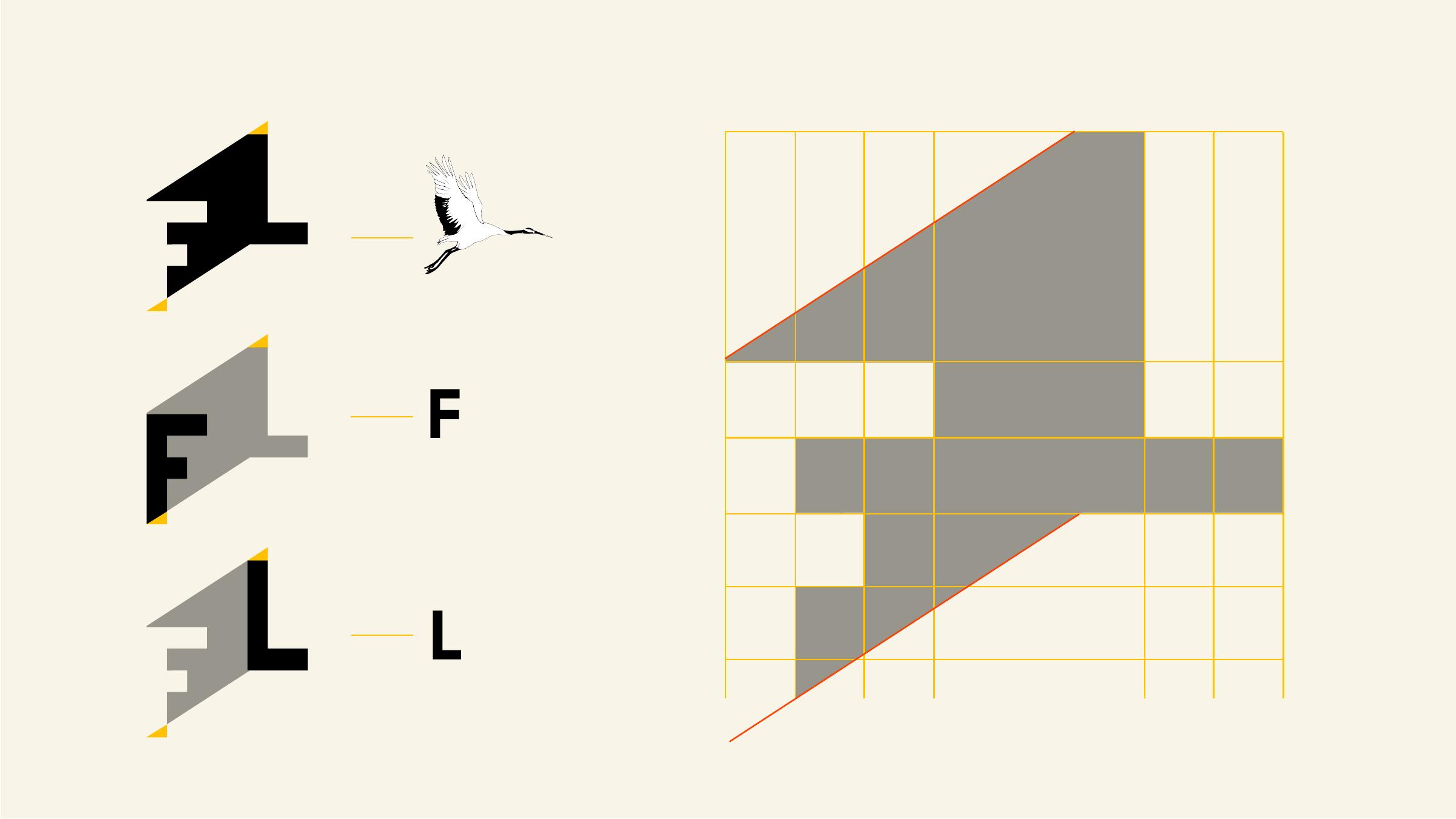
Read left to right it is an F and an L. Read as a silhouette it is a folded sheet in profile, pointing forward. Every angle is 45° or a multiple of it, and nothing curves — because paper does not curve, it creases.

FL mark revealed by the fold
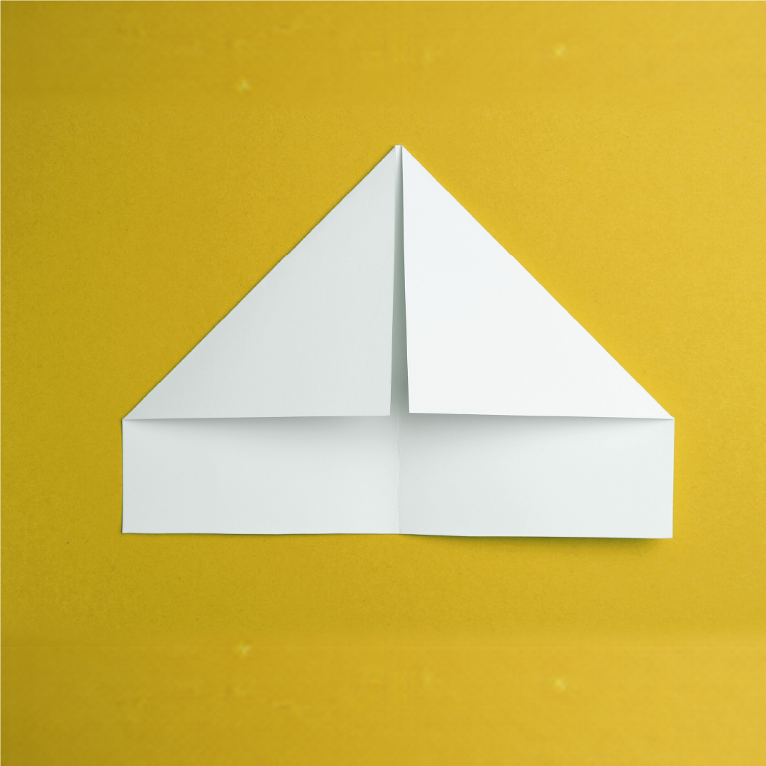
Flat sheet
Try it.

Fold the sheet. Nothing is added and nothing is printed — the mark is simply what the paper does when it is folded once, with intent. Every part of this identity is a consequence of that single move.

Flat Folded
Mark construction
Geometri. 45° ızgara üzerine kurulur. Kavis ve optik müdahale yoktur.
Mark clearspace
Koruma alanı. Logonun çevresinde, FL haznesinin yarı yüksekliği kadar boşluk bırakılır.
Arc wordmark lockupInline lockup
İki temel kullanım. Ana görsel uygulamalarda 96 px ve üzeri kavisli logotype; üst ve alt bilgi alanlarında 24 px ve üzeri yatay kullanım.

A fold cannot be undone. Neither can these.

Hatalı kullanım
Rotated mark, not permitted
Never rotate the mark.
Stretched mark, not permitted
Never stretch or condense.
Mark with shadow, not permitted
Never add shadow or bevel.
Recoloured mark, not permitted
Never re-colour outside the palette.
04 Colour

Four colours, four roles.

This palette was not built simply to make four colours work together; each one has a distinct role. Paper opens the space. Petrol green carries the brand. Ochre directs attention. Ink anchors the copy. Here, colour is not decoration; it creates hierarchy.

Paper
#F6F1E1

The primary ground. Long-form copy, imagery and generous whitespace sit on this surface. It replaces pure white with a warmer, more editorial base.

Teal
#00454D

The primary brand colour. It carries the identity across navigation, strong headline fields, brand panels and reversed applications. It is not an accent; it is the backbone of the system.

Ochre
#D5AD29

The accent colour. Used for numbers, small markers, selected headings and calls to action, it directs attention to a single point. It is not used as a background for long-form copy.

Ink
#0B0B0B

The main text and contrast colour. Used for body copy, rules and, when needed, dark surfaces. It is the most neutral and stable tone in the system.

Proportion creates hierarchy. Paper occupies the largest area; petrol green carries the identity; ochre only directs attention. The four colours should never have equal visual weight.
Contrast comes first. Text and background pairings are chosen for legibility; colour should never compete with the information hierarchy.
One accent, one focus. Ochre should highlight only one thing in a view. Once it starts competing across multiple points, it stops functioning as an accent.
05 Type

One geometric, one editorial.

Gilroy carries the system: a geometric grotesque built from the same straight lines as the mark, tracked tight at display sizes. FH Lecturis is held back for the moments that deserve quiet — a quote, a number, one sentence alone on a page.

Display & body Gilroy · 300 → 900
Aa
Folding success — Light 300
Folding success — Regular 400
Folding success — Semibold 600
Folding success — Extrabold 800
Editorial accent FH Lecturis · 300 / 400
Aa

Reputation is not what you say about yourself. It is what they say about you after you leave the room.

Never below 24px. Never used for body copy.
Display 1
Folding success
800 · −0.03em · 0.92
Heading 1
Folding success in every message
700 · −0.02em · 1.02
Lead
A communications practice for founders building something the world has not seen yet.
400 · 22 / 1.45
Body
Our work is selective and our standard is editorial. We measure a placement by the room it puts you in, not by the number of times it is repeated.
400 · 17 / 1.55 · 70ch
Eyebrow
Media relations · Istanbul, London
600 · 12 · 0.18em
06 Voice

We explain. We do not convince.

Everything written in the firm's name should read like a senior advisor briefing a chief executive: short, declarative and unhurried. The goal is to explain the work clearly and with authority. The message should come from the substance, not from persuasive language.

  1. 01We, for the firm. You, for the reader. I, only in signed pieces by the founder.
  2. 02Sentence case for headings. Title Case is a corporate template; sentence case is editorial.
  3. 03No exclamation marks. No emoji. Not once, in any medium.
  4. 04British spelling, Oxford commas, em dashes and curly quotes. One convention per document.
  5. 05Discretion by default. We describe the work, not the client, unless clearance is in writing.
How we write

FL is a public relations and communications practice based between London and Istanbul. Our work is selective. Our standard is editorial.

Media relations. We place the right story in the right title at the right moment — Bloomberg, Forbes, Vogue, TechCrunch — for clients whose reputation depends on the room they are seen in.

What we never say

Supercharge your PR strategy — get featured today

We are passionate about telling amazing brand stories

Hype, superlatives, and words that could be written by any agency about any client. If the sentence would survive a find-and-replace of the company name, it is not ours.

Where the work lands
BloombergForbesVogueTechCrunchUSA TodayL'Officiel
BBCThe GuardianBusiness InsiderNewsweekYahoo FinanceWIRED
07Uygulamalar

A living identity · 2026 edition

The system is real when it survives contact with the world.

Paper is not a backdrop in this identity. It is the first medium: a surface that can hold a thought, remember a crease and carry it beyond the room. Across every application, the same discipline remains — one decisive fold, generous space, nothing ornamental without a job.

07.1 · Geometry

One line becomes a direction.

The F establishes the frame. The L changes the route. Joined in one continuous construction, they turn a monogram into a record of movement: not a decorative sign, but the moment a message acquires an edge, a spine and somewhere to go.

FL Communications logosunun F ve L harflerinden oluşan geometrik yapısı
Logo yapısı — F ve L, kesintisiz tek bir kat üzerinde birleşir.